Literary Typesetting & Cover Design · Personal Project, 2025
This edition of Mary Shelley's Frankenstein was produced as a complete typesetting exercise during the editorial typography course taught by Enric Jardí at Cursiva.
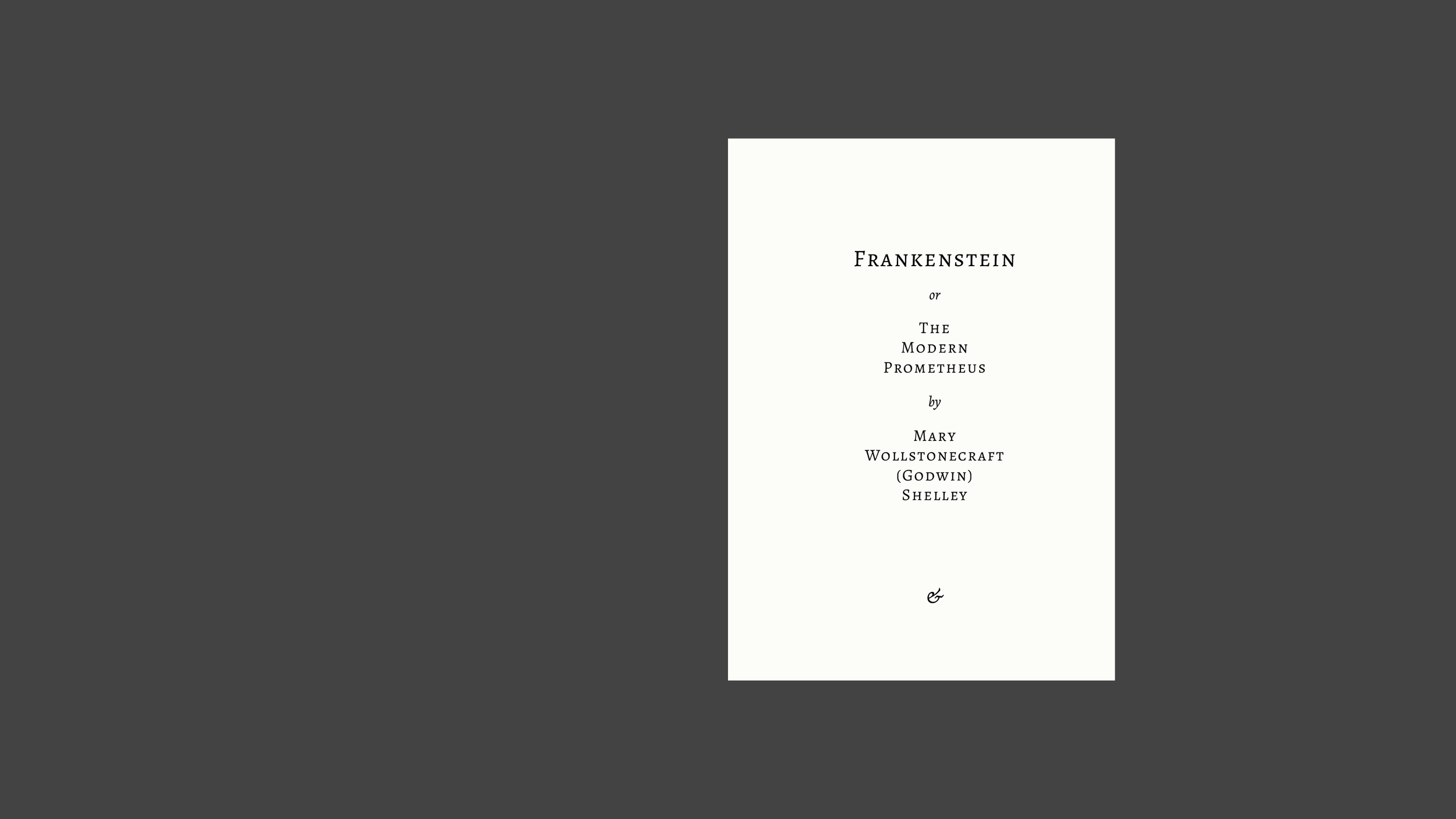
The brief required a full interior executed to a publishable standard: front matter, body text, chapter openings, footnotes, embedded letters, poetry, and table of contents.
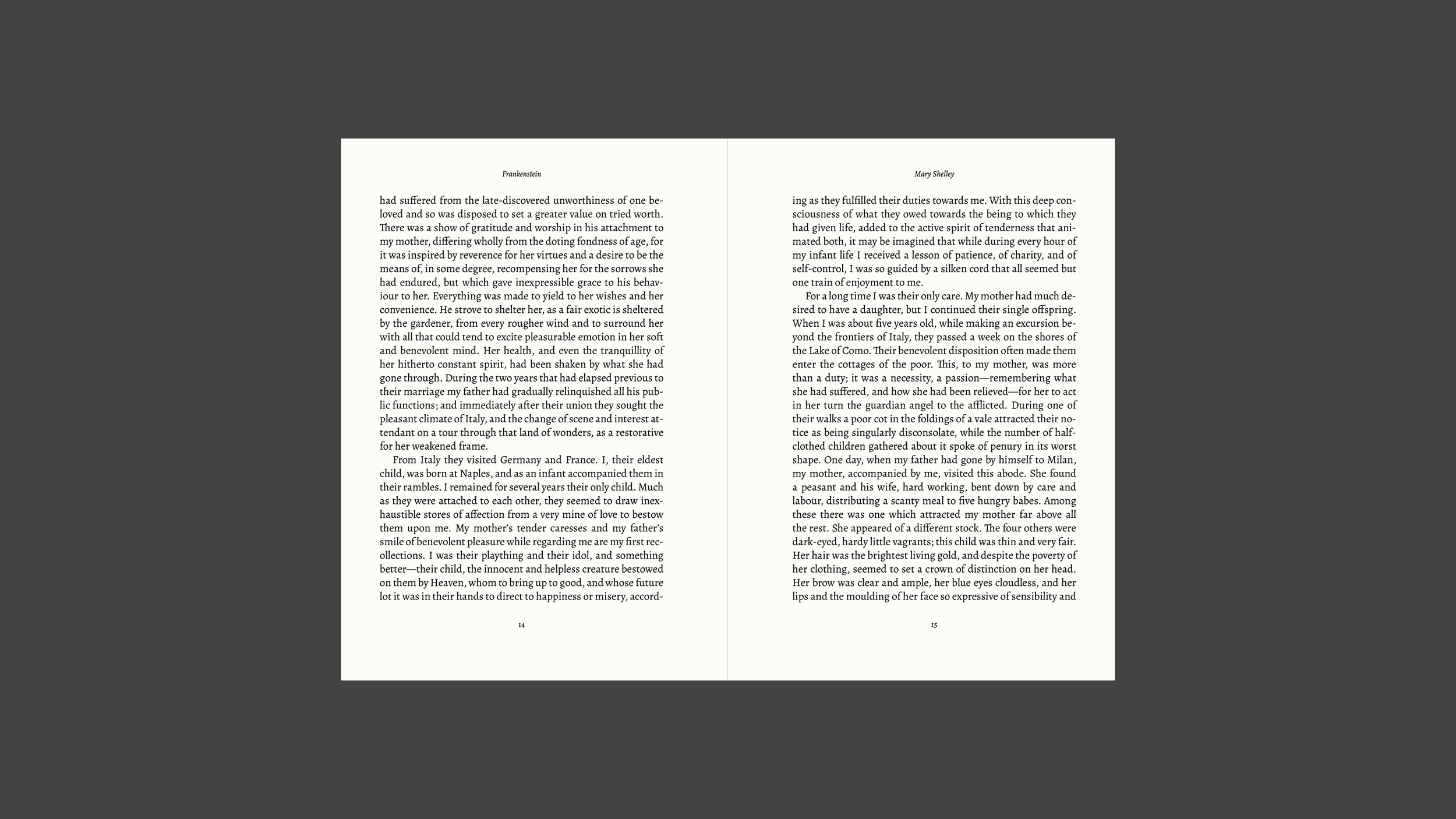
The interior was built with fresh eyes and close attention to the reading experience: what makes a page genuinely comfortable to read, how information hierarchy should behave at each level, how a system of styles can be consistent without becoming rigid.
The result is classical, those solutions are standard for a reason, but the process of getting there involved thinking carefully about each element on its own terms.
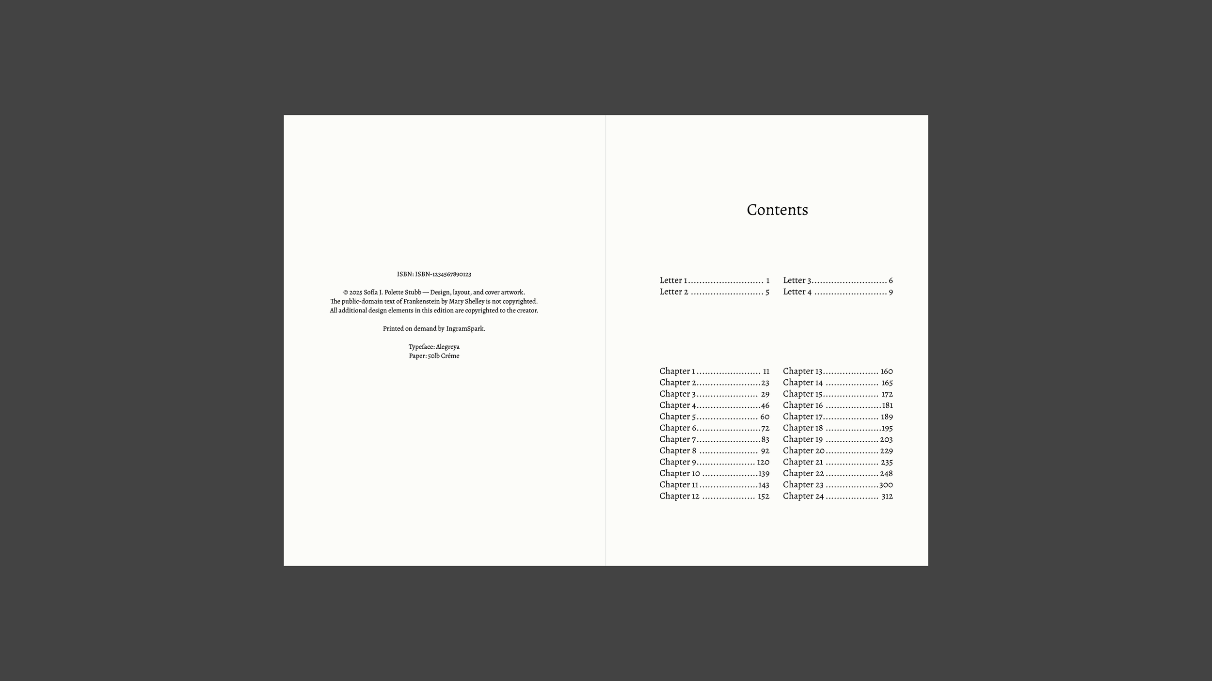
Alegreya as the body typeface, a scholarly serif with enough warmth for sustained reading. Paper: 50lb Crème. Running heads, footnotes, and the italic register for embedded letters and poems, all treated as part of one coherent system.
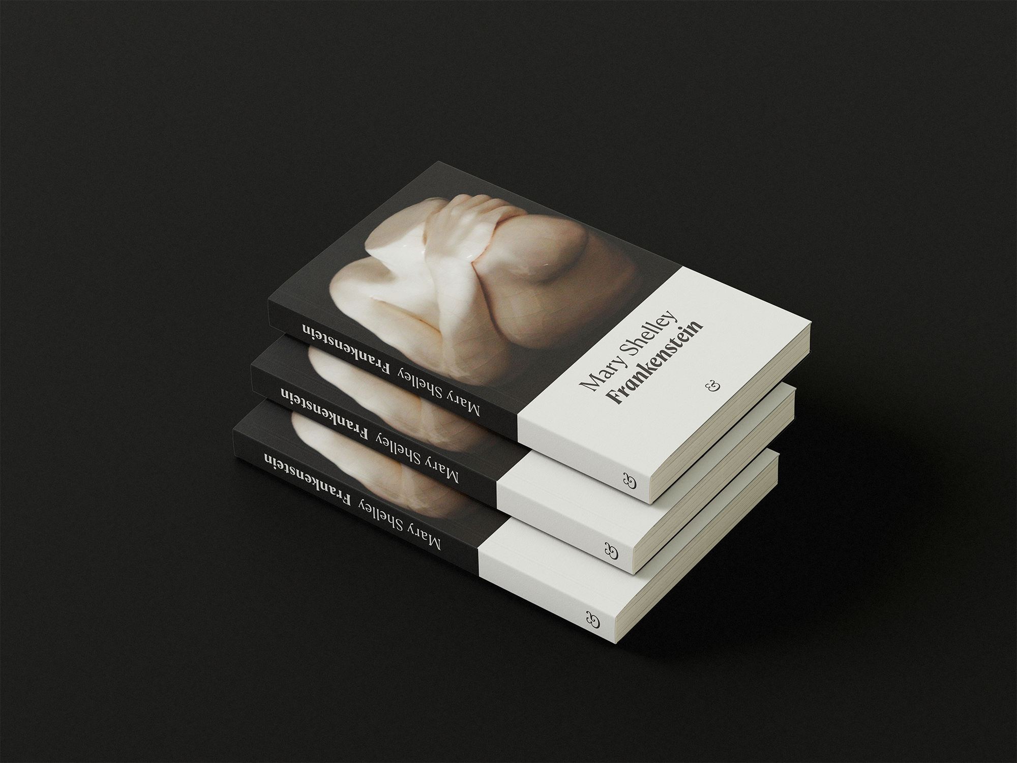
The cover was designed as a visual system rather than a one-off, built to carry other classic horror titles with the image and title swapped while the structure holds. The chosen image, a marble sculpture of entwined limbs, carries the book's central tension without illustrating it literally. A dark upper field against a calm lower band gives the typography room while keeping the whole thing unsettling enough for the genre.