Art Direction & Cover Design · Cursiva, 2024
The brief called for a special hardcover edition of Animal Farm, aimed at young adult readers, conceived as a gift edition. The design needed to earn its place as a physical object worth owning, not just reading.
Cover design exercise developed as part of the Editorial Design Specialist programme at Cursiva.
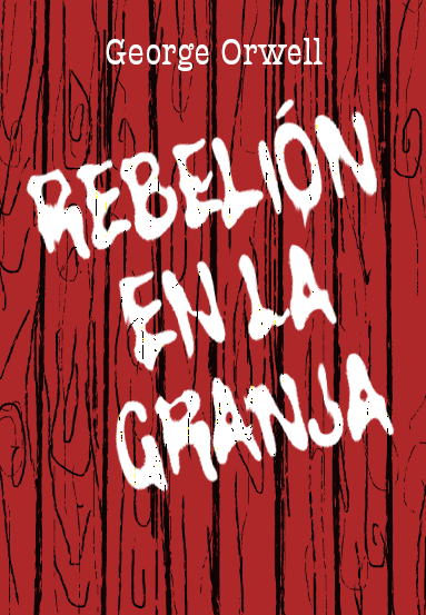
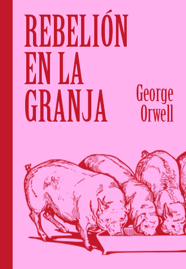
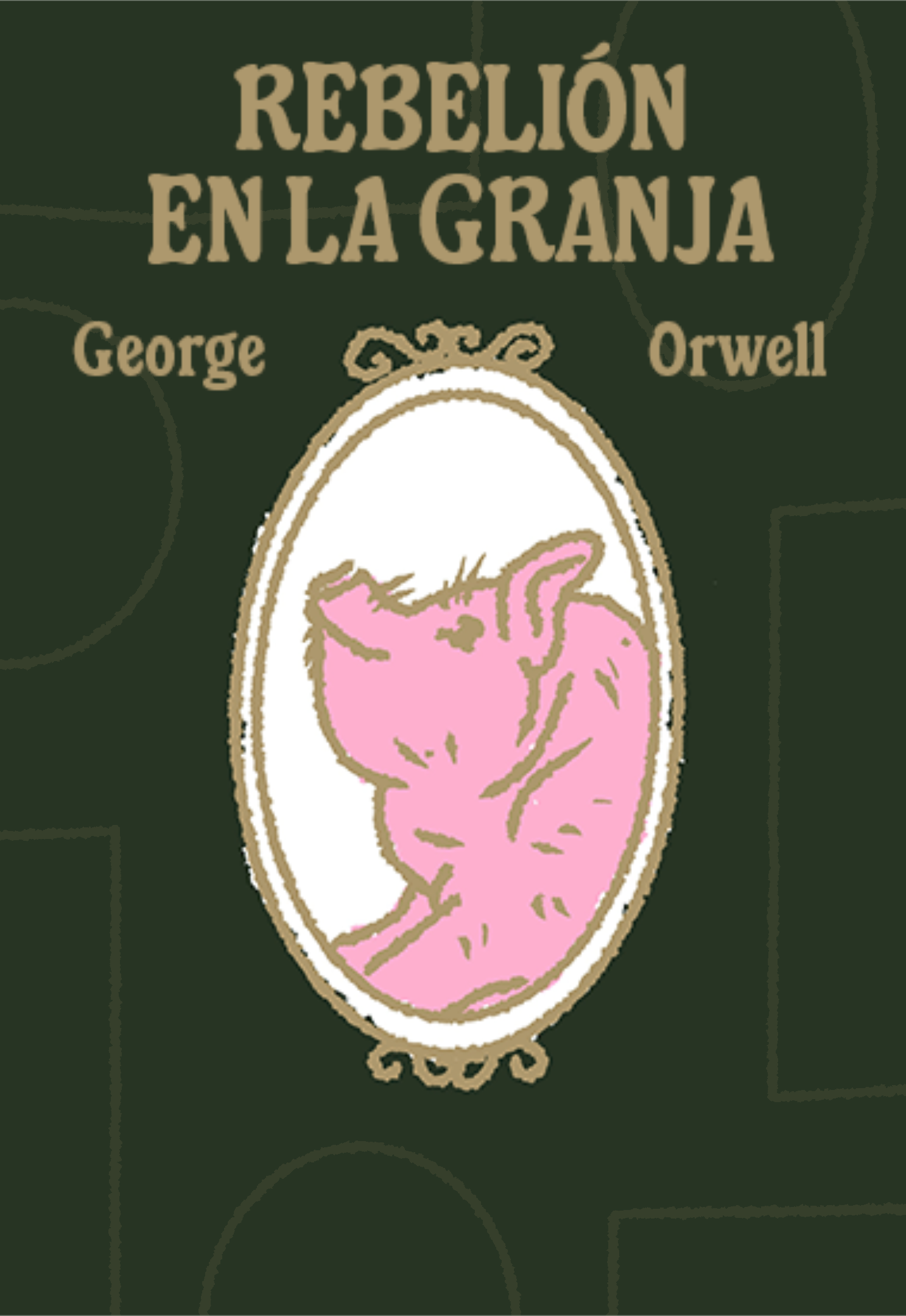
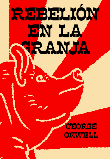
Research began with a systematic survey of how this title has been covered in the past. Every edition of Animal Farm follows essentially the same visual language: pigs, red as the dominant colour, and illustration as the mode.
Orwell's other titles and the wider dystopian canon showed a similar tendency toward warm, analogous palettes with a worn or textured quality. That consistency set the design question: how to stay recognisable while standing apart on the shelf?


Four conceptual territories guided the exploration: revolution, propaganda, power, and corruption. Several visual directions were tested, including photomontage, an etching aesthetic, and expressive lettering.
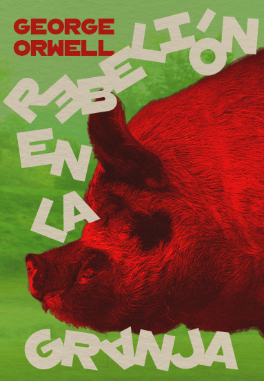

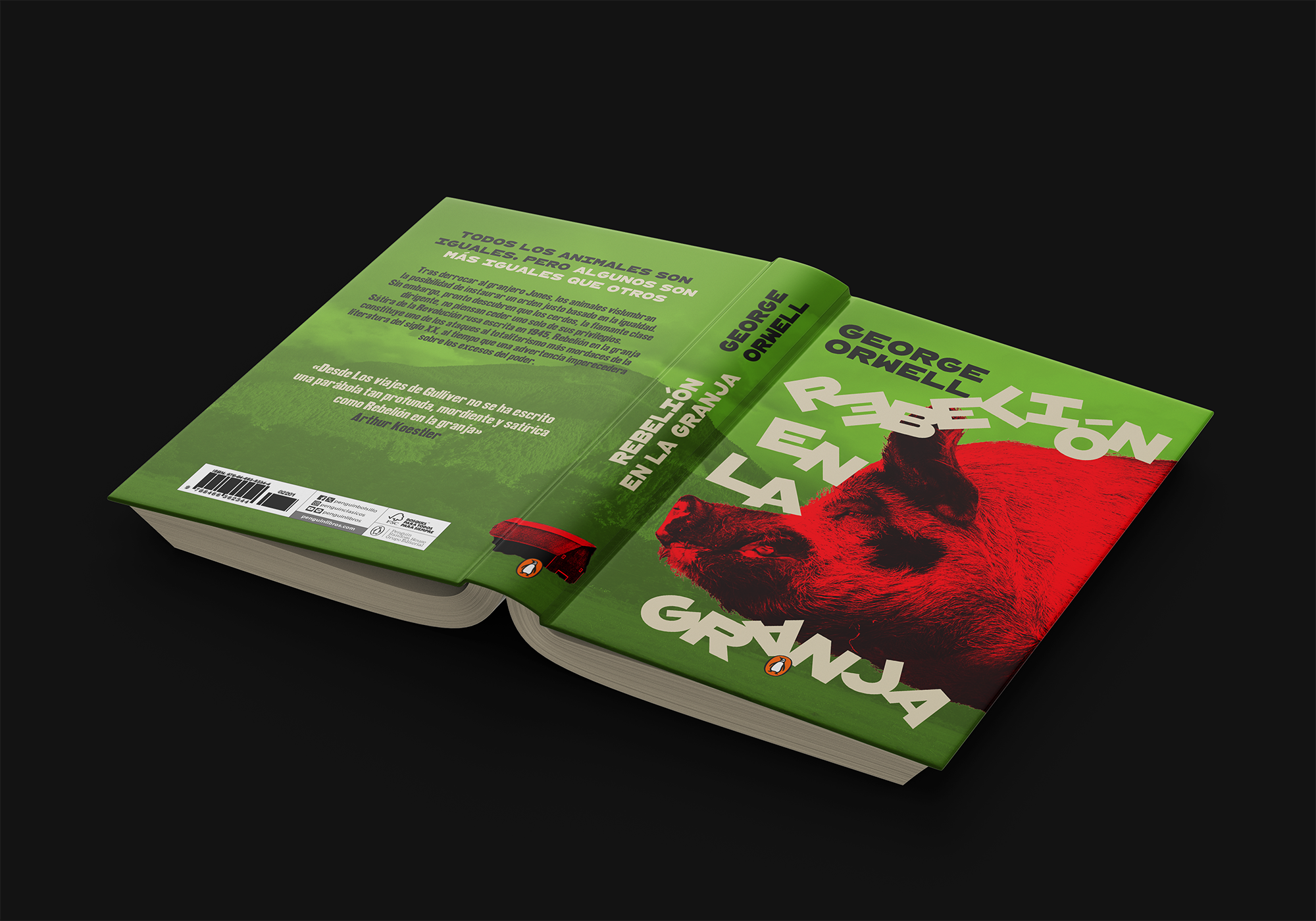
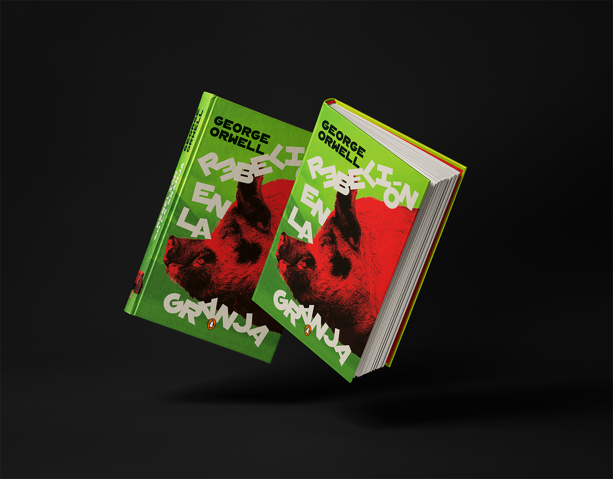
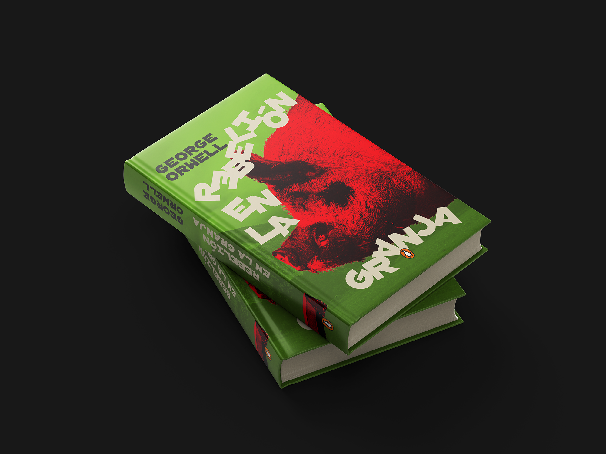
The chosen direction resolved the tension between recognition and differentiation by keeping the pig and the red, the established visual codes for this title, and placing them against a field of neon green. Against a market of warm, worn editions, the contrast is immediate and shelf-dominant.
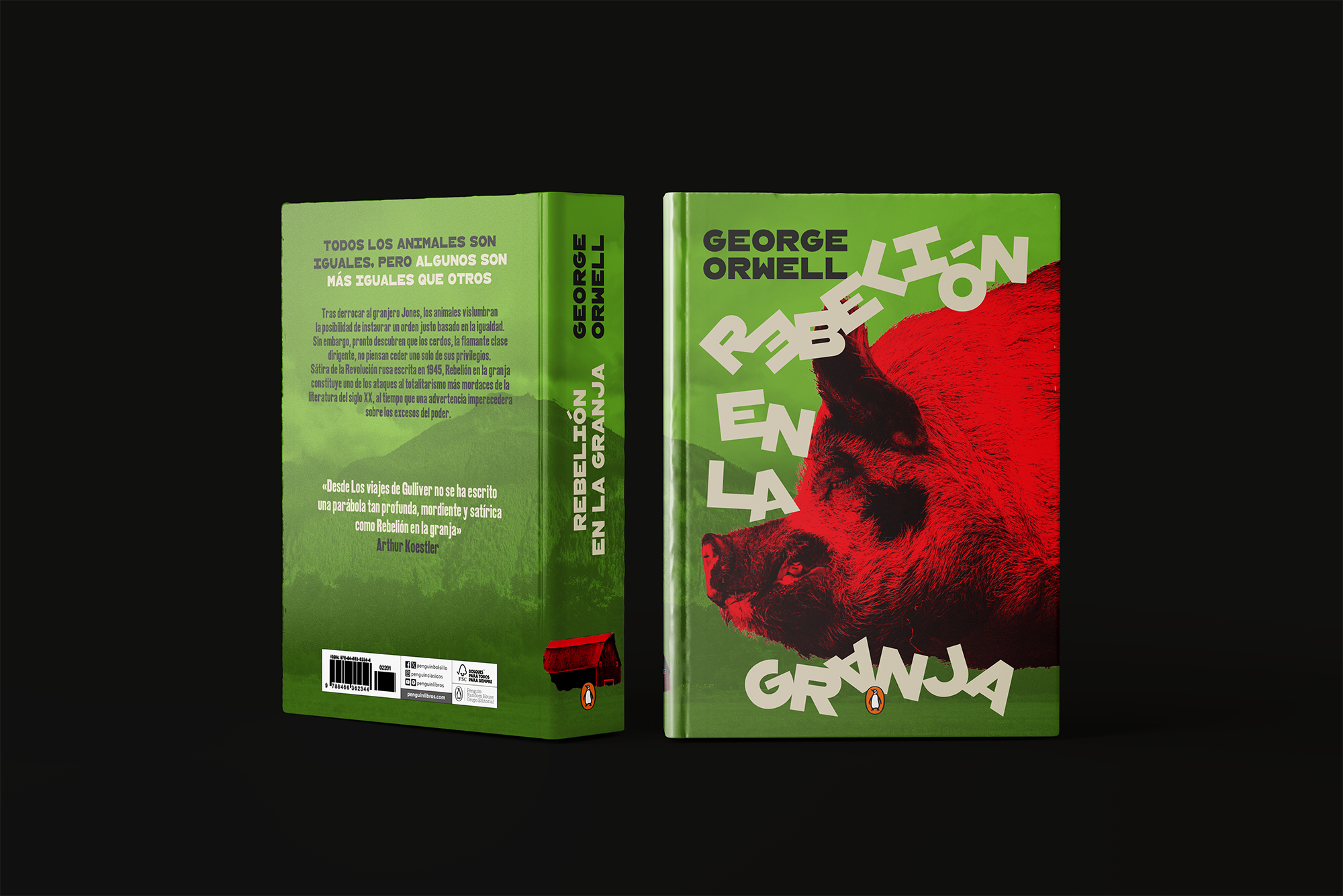
The typography works with that logic rather than sitting apart from it. The title letters are fragmented and distorted, rotating around and through the body of the pig as if the animal is physically asserting itself against the text. The effect ties the visual and verbal layers into a single unified statement. The author name sits clean at the top, providing a stable anchor for the energy below.
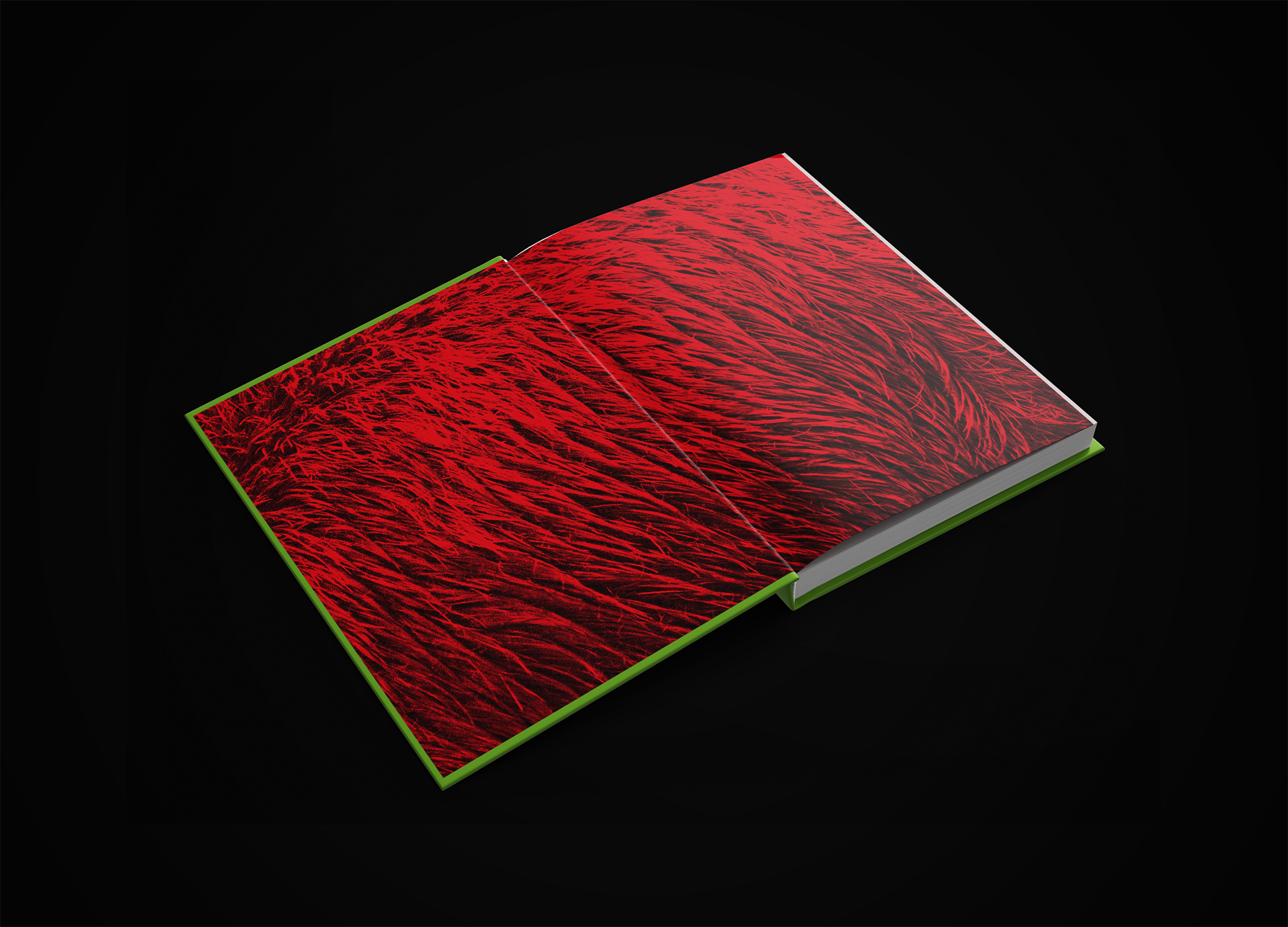
The endpapers extend the cover language into the book object. A pig fur texture, printed in a single ink on red paper, creates a transition from the cover into the text block. The proposed interior paper is natural and uncoated, a material reference to the rural setting of the story and a tactile quality that makes the edition feel considered throughout.
The print specification follows through: neon green and red inks, with black and beige completing a four-ink build; relief matte UV varnish on the title letters for tactile emphasis; and a standard matte varnish on the remaining cover area.